Sunday, June 3, 2012
Last Minute Changes
To the girls doing the contents page…
Under ‘Adography’, the page 15 article title is “Non‐product advertising,” instead of “I Am A Hero”…
And under ‘Phenomenology,’ Clarisse spells her name with one ‘r’ and 2 ‘s’…
If you could fix that up ASAP tonight, that would be great, thanks!
Under ‘Adography’, the page 15 article title is “Non‐product advertising,” instead of “I Am A Hero”…
And under ‘Phenomenology,’ Clarisse spells her name with one ‘r’ and 2 ‘s’…
If you could fix that up ASAP tonight, that would be great, thanks!
Saturday, June 2, 2012
Friday, June 1, 2012
Elise Bouchard - Course Reflection
I have really enjoyed this course this semester,
and it has been one of my favourite subjects overall. I feel I have learnt a
lot about printing and publication techniques thus gaining many new useful
skills.
I enjoyed the first project a lot more as it was
very hands on and interesting in the sense that we had to select the most
appropriate paper stock and colour etc to suit the phrase we were printing. I
am more of a hands on practical person which is why this project really
intrigued me. It was nice to see everyone’s finished booklet as they were all
so different and it was good to see the different ways that people constructed
their booklets and thought process.
Project 2 has also been fun to work on but I didn’t
enjoy it as much as more time was spent on a computer, however I did find it
educational because the weekly lectures and discussion points really helped me
understand the history, processes and procedures I otherwise didn’t know. These
discussion points were good as they were always interesting to respond to and
it was great to be able to read everyone else’s thoughts on the topic.
Overall I had a great experience with this class
and would recommend this course to fellow students.
Thursday, May 31, 2012
Hey everybody…
Thank you for putting
your spreads in the dropbox folder :) – they’re looking really great!
There are just a couple
of things I was hoping some of you could please have a look at and then
re-submit, thanks! (These are all only
tiny little things, I’m sorry if it sounds like I’m being an anal bitch,
promise I don’t mean to!!)
Publication Title Page
The ffi stamp is a bit
rough / pixelated. Could we smooth it out a bit please?
Cartography
Title page – Just where
your initials are, we decided just to put your first initial in lower case,
with square brackets, eg. [k]
Page 7 – your paragraph
corners are grey, where as the other pages in your section are black.
Signography
Page 11 – could you
please put a circle around the page number?
Page 10 – there is no gap
between the left hand side of the folio and the grey/brown strip running down
the side of the page.
And, could you all please
add “type-setters” at the bottom of the page to the left of the folio (6.5mm
gap between the ‘s’ and the circle)… it will sit in the middle of the two grid
lines that enclose the folio space.
Also, your placement of “signography
– the life of signs” is different on each of your spreads. Just a little thing!
Adography
Title page – a tiny thing…
please make your initials lower case.
Page 14 – could you
please centre justify your text with the last line in each paragraph justified
left? And also be careful to avoid hyphens if you can.
Page 15 – again, please
just fix up the paragraph justification.
Page 16 – M.I.A??
Graffiti
Page 18 & 21 – The
folio circle has a grey outline with a black fill. Pages 19 and 20 use a grey
fill. Also in terms of all the folios, please just make sure they’re exactly in
the centre of the circle.
References
If these are being a part
of the publication, could we please put the list on A3 pages like the rest of
the publication and maaaybe spice it up just a little??
Thank you!!
Wednesday, May 30, 2012
Discussion Point/Course Reflection: Elisabeth Parizot
Discussion Point:
I believe (and I know it's sad) that print technology is going to become entirely obsolete in the near future. While it is become less and less relevant to print these days, I do think that it will continue on as a legacy art form. Just as some serious artists still make movies on film or choose to use and old school film camera, there will be those who continue to print. There will also still be a market for books. Though more and more consumers are reading their books digitally, there will always be those tactile people who want to hold a novel in their hands. So while I believe that print will die out as a viable technology, I do believe that it will continue on as a classic art form.
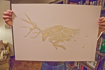
A great example of this is artist Christopher Harrell. He is an artist who works will letterpress and designed a series of posters inspired by the "A Song of Ice and Fire" book series, more commonly known as HBO's Game of Thrones. He created a series of beautiful prints depicting animals that play prominent and symbolic roles in the series. He sells these prints for $35.00 each and guess what -- people really dig them. This leads me to believe that though printing is no longer a viable publishing model, it will remain forever a beautiful artform.
For any fans of Game of Thrones or print artwork, here are some of his prints:


Course Reflection
I have to admit, I was a little bit nervous about taking this course. The fact that there was the word "Advanced" in the title made me think that I might not be prepared for it. However, from the very first day of class I felt comfortable and was pleased to see that there were students of all skill levels present. I truly felt that we each had the opportunity to grow and learn without feeling overwhelmed.
I quite liked both projects that we did. The first was a great experience and I'm so glad that I got to do letterpress. I think that it's a valuable experience for anyone who is interested in art. I also enjoyed that we had to consider binding techniques as well as paper selection. A great project overall.
This second project has been great as well. Though I find myself wishing that we had more time to work on it, I am very happy with it overall. I think the course has done a good job of balancing older publication technologies with the newer ones. It has been eye opening to go from one end of the spectrum to the other. All in all, this course actually ended up being my favourite of the semester.
I believe (and I know it's sad) that print technology is going to become entirely obsolete in the near future. While it is become less and less relevant to print these days, I do think that it will continue on as a legacy art form. Just as some serious artists still make movies on film or choose to use and old school film camera, there will be those who continue to print. There will also still be a market for books. Though more and more consumers are reading their books digitally, there will always be those tactile people who want to hold a novel in their hands. So while I believe that print will die out as a viable technology, I do believe that it will continue on as a classic art form.
A great example of this is artist Christopher Harrell. He is an artist who works will letterpress and designed a series of posters inspired by the "A Song of Ice and Fire" book series, more commonly known as HBO's Game of Thrones. He created a series of beautiful prints depicting animals that play prominent and symbolic roles in the series. He sells these prints for $35.00 each and guess what -- people really dig them. This leads me to believe that though printing is no longer a viable publishing model, it will remain forever a beautiful artform.
For any fans of Game of Thrones or print artwork, here are some of his prints:


I have to admit, I was a little bit nervous about taking this course. The fact that there was the word "Advanced" in the title made me think that I might not be prepared for it. However, from the very first day of class I felt comfortable and was pleased to see that there were students of all skill levels present. I truly felt that we each had the opportunity to grow and learn without feeling overwhelmed.
I quite liked both projects that we did. The first was a great experience and I'm so glad that I got to do letterpress. I think that it's a valuable experience for anyone who is interested in art. I also enjoyed that we had to consider binding techniques as well as paper selection. A great project overall.
This second project has been great as well. Though I find myself wishing that we had more time to work on it, I am very happy with it overall. I think the course has done a good job of balancing older publication technologies with the newer ones. It has been eye opening to go from one end of the spectrum to the other. All in all, this course actually ended up being my favourite of the semester.
Subscribe to:
Posts (Atom)