Sunday, March 25, 2012

Welcome to Week 5 :)

This week is all about refining and finalising your response to Project 1. We hope you've found the process a rewarding one.

In presenting your final work please ensure you have given the Design Specifications and Assessment Criteria the appropriate amount of consideration.


Design Specifications:
— Demonstrate the application of illustrative/display typography
— Size: self-directed (consider an appropriate size for your chase, type, etc.)
— You may explore different materials for printing on, suited to your design
— Single colour design, printed on 2 sides
— The postcard will be printed in wood type
— A considered design which includes visual hierarchy, scale & proportions, word spacing, line-spacing and letter spacing, etc.)


Assessment Criteria:
Studio Research (20%)
Demonstrated understanding of a range of historical and contemporary approaches to letterpress typography.
Evidence of understanding of visual hierarchy for typographic designs in print
Design Concept (40%)
Documentation of experiments with conventions and innovation in print publication design using advanced typographic structures.
Effective contributions to discussions about diverse cultural associations communicated by letterpress typographic treatments.
Presentation of innovative typographic concepts that address current issues.
Designed proposal for letterpress printing produced as a Rapid Prototype letterform.
Design Synthesis (20%)
Designed outcomes that address a deadline, budget, and the needs of an identified audience.
Worked collaboratively in groups for print publication production.
Design Presentation (20%)
Prepared and presented prototypes of typographic letterpress publication designs at an advanced level.

This week's additional resource is a very nicely put together short film about letterpress. Do check it out. I was going to post about one of the few remaining movable-type printing workshops in the UK, situated at Plymouth University but then I realised that Rowland had also posted a similar video earlier (make sure you have a look at his post below).

Letterpress from Naomie Ross on Vimeo.

Upside Down, Left To Right: A Letterpress Film from Danny Cooke on Vimeo.

We will begin next week to think about the second project in the elective - the collective collaborative task of designing an online publication. If you haven't already begin to check out the brief and do drop over to have a look at the last project produced by students from this elective - just to get the creative juices flowing.

Finally next week we will begin the series of online lectures that are released weekly over the remainder of the semester. So - like I said  - LOTS happening. Stay tuned. See you next week.
Monday, March 19, 2012

Welcome back - Week 4 already!

http://www.fastcodesign.com/1662896/freedom-of-creation-unveils-customizable-3-d-font
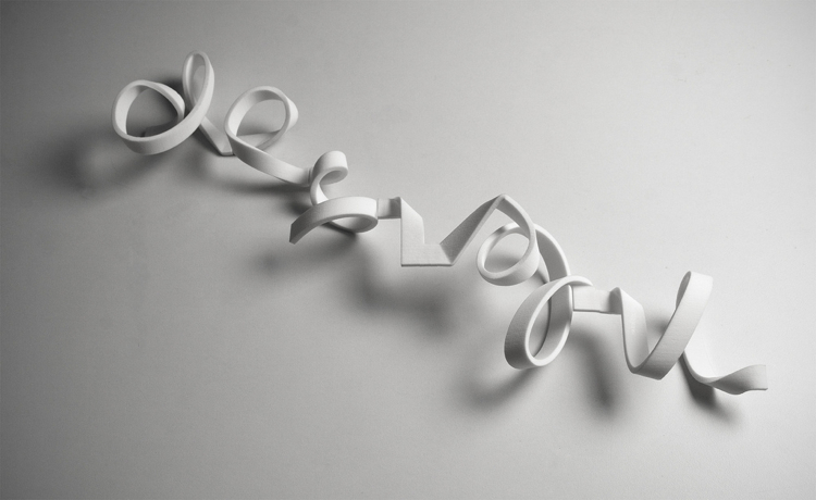
Well, although our scheduled introduction to Rapid Prototyping did not materialise this week I thought as a small compensation it would be appropriate to post soem interesting material related to this emergent area of typographic practice. There are two instances I'd like to draw your attention to. Although there is no substitute for hands on experience these examples will give you an idea of why 3D Rapid prototyping might be relevant to typographic practice. Undoubtedly we are in the area of more experimental approaches to practice - Please take the time to check these out and in the case of the Freedom of Creation interface - have a play...
The Dutch rapid-prototyping juggernaut Freedom of Creation has released an arty new font designed explicitly to be printed in 3-D. The result is a snaking, spiraling, sinewy typographic sculpture that's totally customizable and would look right at home on the mantle.
Make sure you drop by the actual interface that allows you to generate the typeface itself.
You can find it here: http://www.freedomofcreation.com/kasheeda/latin/#

http://helloantique.blogspot.com.au/2010/05/3d-print-of-graffiti.html


Ok, sticking with the use of new technologies within experimental typographic practices these images (above) and videos showing experiments with 3D Printing and sculptural graffitti are quite interesting - at the least showing us the potential of creating complex forms that might be deployed in letterpress.


There is plenty to do of course. In lieu of that taster of the interface between new technologies and traditonal Letterpress use the time to focus on the refinement of your design for Project 1.


These are the things to keep in mind as you prepare the final submission:


In ‘Letterpress Booklet’ you will engage with notions of ‘typographic voice’ and specialist type history. The booklet shall
present three newspaper headlines you are asked to modify and layout to express an aspect of contemporary media experiences.
Each page of the booklet will be a single-colour design printed on two sides, which demonstrates an advanced knowledge of display typography, and an understanding of the history of the design surrounding your chosen types.
Design Specifications:
— Demonstrate the application of illustrative/display typography
— Size: self-directed (consider an appropriate size for your chase, type, etc.)
— You may explore different materials for printing on, suited to your design
— Single colour design, printed on 2 sides
— The postcard will be printed in wood type
— A considered design which includes visual hierarchy, scale & proportions, word spacing, line-spacing and letter spacing, etc.)
Although the research and concept development have been evolving over the duration of the project to date remember that we will be assessing the whole as a package including your work in the earlier stages. Don't neglect the Assesment Critieria.

Assessment
PROJECT 1: LETTERPRESS Booklet
Studio Research
Concept 
Synthesis
Presentation


Ok, have a good week and do let us know if you have any questions or problems wiht the current project.

Thursday, March 15, 2012

Upside Down, Left To Right

So i stumbled across this video on letterpress that i thought was pretty cool. Enjoy


Wednesday, March 14, 2012

IMPORTANT ANNOUNCEMENT RE MONDAY

Hi Everyone. Hayden Youlee has advised us that he is unable to make it to our scheduled Monday session about Rapid Protoyping.

Therefore please attend the studio at the usual time on Monday.

Ian

Sunday, March 11, 2012

Welcome to Week 3 :) I hope you had a great weekend!

It's already clear I think, that already we have developed a really entertaining, comprehensive and informative compendium of information about typefaces that enjoy popular currency in graphic design and publishing contexts. The imagery is vibrant and the examples are relevant to our study area. Well done everyone!

Wondering how Letterpress relates to contemporary deployment of type? We know letterpress is kind of cool/trendy in recent years - sort of like the typographic equivalent of vinyl records - but how might it link to a more hi-tech application of typography. Have a look at this project on the crowdfunding website Kickstarter - very interesting...


The focus of this week is right on getting to grips with your design and the letterpress process in the studio. As expressed in the course notes it says:

Studio: Letterpress technique. Continue composition and printing of letterpress booklet.
Self-Directed: Refine selected designs for printing in next class.

Have a great week!

PS: If anyone is having trouble with the blog, not getting updates etc. (or any other aspect of the studio) please do get in touch so we can sort you out :)

Friday, March 9, 2012

SRI 1: Katrina Hirakis


When one thinks of a typeface, Avenir would not be commonly thought of. This is due to its only current success in the print publishing of the famous poster, "Keep Calm and Carry On". 


Keep Calm and Carry On was just one in a series of posters of World War 2 drawn up by the UK Ministry of Information. The posters were displayed as a stark white text on a red background, with the only image on the poster being the royal crown of George VI. At the end of the war, the posters were collected and destroyed (only two original posters survived to this day). 


Keith Bates recreated the original font as closely as possible by taking examples from the original poster and the two others in the same series to create the marketed poster distributed today.


The closest pre-existing match to the original text is a font called Avenir, designed by Adrian Frutiger in 1988. Avenir is classified as geometric sans-serif typeface, who's name is French for 'future'.


  • Avenir, "takes inspiration from early geometric sans-serif typefaces Erbar and Futura. Frutiger intended Avenir to be a more organic, humanist interpretation of these highly geometric types".


When originally introduced in 1988 Avenir's design features included three stroke weights which used two-digit weight and width convention for names [45 (book), 46 (book oblique), 55 (text weight), 56 (text weight oblique), and 75 (bold)]. Later, in 2004, Frutiger changed the font to address on-screen display issues ending in a reworked font called, Avenir Next. 

Today Avenir is used in not only the, "Keep Calm and Carry On Posters", though is seen throughout everyday life;
  • LG Electronic uses Avenir as the primary button typeface for most of their cellular phones.
  • The city of Amsterdam uses Avenir as principal typeface in its corporate identity.
  • BBC Two has also begun to use Avenir as its main corporate font in its logo and identity.
  • Dallas/Fort Worth International Airport and Hong Kong International Airport uses Avenir extensively as a part of its way-finding signage and brand identity.
Reference List:
  1. "What is 'Keep Calm and Carry On'?" (2011). Retrieved from http://www.keepcalm-o-matic.co.uk/guide_to_keep_calm/
  2. "Avenir Next" (2012). Retrieved from http://www.linotype.com/en/2090/avenirnext.html
  3. "Avenir" (2010). Retrieved from http://typophile.com/node/12462
  4. "Avenir" (2012). Retrieved from http://www.fonts.com/font/linotype/avenir

Thursday, March 8, 2012

SR1: Brendan Pestana


Didot

Designed by Firmin Didot in 1783, the Didot typeface is characterized by consistently horizontal stress, flat and unbracketed serifs, and a high constrast between thin and thick strokes.

During the late eighteenth century the style dominated modern culture. Didot was a member of the Parisian dynasty that dominated French typefounding for two centuries. He is known today for drawing inspiration from the cultures of Ancient Greece and Ancient Rome and appropriating it into a modern style.

Firmin Didot was a French printer, engraver and type founder. He invented the word “Stereotype”, which in printing refers to the metal plate created for the actual printing of pages, as opposed to printing pages directly with moveable type. The original method of application of the Didot print was composed using these metal machines. 

Along with Giambattista Bodoni of Italy, Firmin Didot is credited with establishing the use of “modern” classifications typefaces. This typeface remained the standard in France for a century and still is used widely today. It remains France’s greatest contribution to type design.

Baskerville’s types, compared with their Old Style (or Garalde) predecessors, are marked by high contrast between thick and thin strokes. The classifications Moderns and Didones take this contrast to further extremes (just about as far as one can take them). Didot is both these classifications.


Characteristics
1. High and abrupt contrast between thick and thin strokes
2. Abrupt (unbracketed) hairline (thin) serifs
3. Vertical axis
4. Horizontal stress
5. Small aperture


Both the Didones and the Modern types share a common vertical (rationalist) axis, yet the moderns have greater contrast between strokes. The Didones are also said to have drawn inspiration from Romantic themes. 
The vertical axis and horizontal stress of the Moderns creates an elegant, calm and controlled look. The styles are best suited for short text, as the verticality of the letter forms interferes with the text’s horizontal rhythm, leading our eyes up and down.


Modern-day Moderns
Moderns are usually the mark of an expensive  or premium brand. Common in high-end fashion magazines.
Johnathan Hoefler is responsible for reworking the old archetecture of the Didot typeface into something more contemporary.


References

http://typedia.com/explore/typeface/didot/

http://www.typography.com/fonts/font_overview.php?productLineID=100004

http://www.identifont.com/show?2T3

http://ilovetypography.com/2008/05/30/a-brief-history-of-type-part-4/


Monday, March 5, 2012

It was good to meet you all yesterday...

Hi Everyone, it was good to drop into the studio and meet you yesterday morning. As I mentioned yesterday, and perhaps as you've already discovered during the first research task, the blog offers us the opportunity to post links, images and video that we find to share with each other.

The posts in response to the first blog post of the semester are great. There is as one might expect a wide diversity of selections  and the level of discussion is sound. I think it is a good start to the process we are undertaking. Well done everyone. If there is anyone who has yet to post please do this as soon as possible.

 Lauren  may already have mentioned the video on The Hatch Show Letterpress Museum but if you have yet to view it please take a few minutes to check it out.


Also if you have yet to - remember to head on over to Lectures and follow the link to the first lecture What is Typography? You'll find the lectures are generally fairly conversational in tone but full of information and links out to other resources.

Have a great week!

Janice Wong - Apple Garamond


Apple Garamond (introduced by Tony Stan)
When one think of typefaces on newspapers and magazines, the few things come to their mind are probably miller headline stainless and Farnham display. However, have you ever thought of the marketing fonts of brands like mobile companies and technology firms?
With reference to the introduction of the Macintosh in 1984, Garamond is adopted as a new corporate front of Apple, called Apple Garamond. It was a combination of the classic Garamond typeface, having the features of a narrow shape and a taller x-height. Basically, apple Garamond was created out of ITC Garamond (introduced by Tony Stan in 1977) which was condensed to 80% of its normal width. However, Apple felt that the existing ITC Garamond was too narrow. Bitstream condensed the font and subtly adjusted the stroke widths and created a postscript font apgram and then delivered to Apple.

AppleGaramond-Light.ttf
AppleGaramond-LightItalic.ttf
AppleGaramond.ttf
AppleGaramond-Italic.ttf
AppleGaramond-Bold.ttf
AppleGaramond-BoldItalic.ttf
First seen on DaFont: before 2005


In cases when the Apple logo was accompanied by text, it was always set in Apple Garamond. Aside from the company name, most of Apple's advertising and marketing slogans such as "Think different." used the font as well.

The iMac was the first Mac to depart from the Apple Garamond branding.

This typeface has been an identical representation of Apple for almost two decades and formed a huge part of Apple's brand recognition. It was not only used as the logo, but also in manuals, ads, and to label products with model names.
Apple has not released the true Apple Garamond font. ITC briefly sold ITC Garamond Narrow - Apple Garamond without the custom hinting - as part of its Apple Font Pack in the 1990s. A version of the font was also included under a different name in some versions of Mac OS X prior to 10.3 as it was used by the Setup Assistant installation program.

Reference list:
Fonts2u (2012). Apple Garamond True Type, viewed 4th March 2012, http://www.fonts2u.com/apple-garamond.font
 Francois K (2005), “Welcome back, Apple Garamond”, viewed 4th March 2012, http://www.oreillynet.com/mac/blog/2005/10/welcome_back_apple_garamond.html
Typedia (2011). Apple Garamond, viewed 4th March 2012, http://typedia.com/explore/typeface/apple-garamond

Sunday, March 4, 2012

Myriad - Lana Bromley


Myriad is a san-serif typeface designed by Robert Slimbach and Carol Twombly for Adobe systems in 1991. This typeface was designed specifically for use through digital technology. It is classified as a humanist font, being those based on classic romans without serifs, becoming organic and softly rounded. According to Slimbach (2011), the goal was to create a generic looking font, "almost a totally invisible type of letter, just very generic… something that really didn't show anyone's personality too much". This was assisted through the project using a collabroative approach, without the mannerisms or style of one designer in particular shining through.
The typeface is best known for its usage by Apple, replacing Garamond as Apple's corporate font since 2002. The font is prominently featured throughout all of Apple's advertising, in particular the iPhone, iPad and iPod ranges. Myriad is also the default font for Adobe Illustrator and is included in all of Adobe’s branding and products. 

Often been compared to humanist typeface Frutiger (designed by Adrian Frutiger in 1975), the font is easily distinguished from other san-serif fonts due to the tail of its 'y' and slanting 'e', with Myriad being more condensed than the latter. It has straight stems, flat endings and character shapes with subtle geometric shaping.


There are eight variations in the Myriad typeface. This includes, Myriad Pro (OpenType, the expansion released in 1992 which included a wider range of weights), Myriad Web (TrueType, optimised for onscreen use) and Myriad Wild (slightly more irregular). The font also comes with a wide variety of weights and widths, from light italic to semibold, provides a generous creative palette for many digital compositions. 
The Myriad typeface has been very popular since its release, possibly due to its legibility and energetic and modern feel. Apart from Apple's regular use, many brands use the Myriad typeface in logos and branding. For example, Nippon Airways uses it for the promotional material for it's new business class services, Woolworths through its logo and branding and also Linkedin in its text-based logo. 


References:
'Myriad' (2010), Retrieved 5th March from http://typophile.com/node/28658
‘Know your type: Myriad’ (2011) Retrieved 5th March from http://idsgn.org/posts/know-your-type-myriad/
‘Myriad Font Family’ (2012), Retrieved 5th March from http://www.linotype.com/1257/Myriad-family.html

SR1: Elise Bouchard


References:

'Helvetica - Swiss Legacy' (2012) Retrieved on 4th March 2012 from http://swisslegacy.com/category/helvetica/
Perks, M. (2007) 'Tracing the History of Helvetica' Retrieved on 4th March 2012 from http://www.spiked-online.com/index.php/site/article/4123/
Rana, S. (2011) 'All About Helvetica Font' Retrieved on 4th March 2012 from http://slodive.com/web-development/helvetica-font/
Strauss, K. (2010) 'The History of Helvetica' Retrieved on 4th March 2012 from http://www.behance.net/gallery/The-History-of-Helvetica/160455
'The Simplicity of Helvetica' (2010) Retrieved on 4th March 2012 from http://www.webdesignerdepot.com/2010/01/the-simplicity-of-helvetica/

Courier - Elisabeth Parizot


Courier.

When one thinks of typefaces, they often conjure up images of Times New Roman, Helvetica, Comic Sans, and others of the like. Very rarely do we think of Courier, yet it is arguably one of the most recognizable fonts of all time. It was designed in 1955 by a typographer working for IBM named Howard J Kettler. Because IBM did not copyright Kettler’s design, it soon became the standard font for typewriters everywhere.


At the time, Courier was thought to be streamline and sophisticated, unlike the fonts of the past. Initially called Messenger, Kettler renamed his design Courier. He said, “A letter can be just an ordinary messenger, or it can be the courier, which radiates dignity, prestige, and stability.” It seems that Kettler, also often referred to as “Bud,  was correct because Courier soon became the standard font of the US State Department’s official documents.

Courier is a “monospaced” font, which means that each of its letters share the exact same width. This was done back in the 1950’s to facilitate the correction of errors when typing on a typewriter. This makes it easier to replace the letter “t” with the letter “m”, for example. Once the shift from typewriters to computers began to take place, Courier did not disappear. Because of its visual familiarity, it transitioned from one technology to the other.

College, Chealsea. "Sex Issue: Type Tart Cards." Www.wallpaper.com. Web. 04 Mar. 2012. <http://www.wallpaper.com/sex-issue/tart-cards/chelsea-college-17-of-17/1171>.


Today, in the twenty first century, Courier has become less and less popular. In fact, in 2004, the US State Department banned Courier size 12 from all documents and has replaced it with Times New Roman size 14, calling it “more modern”. It would seem that after several decades, the glory days of Courier have come to an end. Though it continues to be the standard typeface of screenplays, it is now little more than a nostalgic nod at the past.

Courier, as a font, is not particularly striking. Though it was once considered to be cutting-edge, it now exists as a reminder of a simpler time. One might now use this font to remind viewers of the obsolete technology that it came from – the typewriter. In addition to this, Courier (or Courier New, since 1990) might be employed by graphic designers to reference government documents. It represents bureaucracy and officialdom. 

Www.identifont.com. Web. 03 Mar. 2012.


Reference List
  • "Typeart History." Www.typeart.com. Web. 02 Mar. 2012.
  • "Courier Font Family Information." Fontco. Web. 02 Mar. 2012.
  • Vanderbilt, Tom. "How the U.S. State Department Put the Kibosh on the Typewriter Font." Slate Magazine. 20 Feb. 2004. Web. 02 Mar. 2012. 


SR1: Gemma Williams

Bodoni is a series of typefaces created by Italian typographer Giambattista Bodoni in 1798. This serif typeface is classified as Didone modern.

Giambattista Bodoni was the son of a printer and understood the skills and techniques of the printing profession. At the age of 18 he began work as a typesetter for the Vatican’s Propaganda Fide printing house in Rome. Here he became interested in oriental and exotic typefaces. Later in his career, Bodoni became very interested in the work of John Baskerville who was known for his transitional typeface. Bodoni was influenced by Baskerville’s ideas, which broke away from the standards in type design at the time. These ideas included the design of type that had a more open letterform and an increased stroke contrast.

Bodoni was also heavily influenced by French typographers Pierre Simon Fournier and Firmin Didot. Some think that Bodoni was too influenced by Didot as there are striking similarities between the two designers’ work. However under close examination many differences can be seen such as the more gradual weight transitions as well as the bracketing on the serifs in Bodoni’s designs. Didot’s designs have very thin serifs and more vertical strokes.

Other notable characteristics of this typeface include the double story, lower case ‘a’, the centred tail underneath upper case ‘Q’ and the very slight hook of upper case ‘J’.

The typography Bodoni produced is still regarded as some of the most refined and structured printing ever produced. He is remembered for his elegant and sophisticated typefaces, which he developed in the late 18th century. These typefaces remained popular throughout the 19thcentury and have been modernised by contemporary designers.

The first modern revival of Bodoni was designed by American typographer Morris Fuller Benton in 1910. Benton tried to choose the best qualities of Bodoni when designing his typeface, which would serve as the foundation for every new Bodoni to follow in the next 80 years.

‘Bodoni Classic’ designed by Gert Wiescher is said to be one of the closest interpretations of Bodoni’s original typeface. It embraces several characteristics not found in other interpretations of Bodoni’s work. These include the ball serif on the tail of upper case ‘R’ and the cursive strokes of italic lower case ‘v’, ‘w’, ‘x’ and ‘y’.


Bodoni’s extreme contrast in stroke weight and hairline serifs often make it difficult to use. When used for body text it can be very hard to read, however when used for headlines it can create a sophisticated and elegant tone when other typefaces demand attention.

In recent years Bodoni has been used increasingly by designers for visual identities, posters and promotional items, demonstrating how versatile and elegant Bodoni can be.

http://nubbytwiglet.com/2011/06/14/the-typofiles-83-i-love-bodoni/


http://www.gingkopress.com/ima/i-love-type-03-bodoni_i2.html


References:

‘Illuminating Letter: Bodoni’ (2009) Retrieved 4th March 2012 from: http://www.itcfonts.com/NR/rdonlyres/

‘A Brief History of Type’ (2008) Retrieved 4th March 2012 from: http://ilovetypography.com/2008/05/30/a-brief-history-of-type-part-4/

‘Font Designer: Giambattista Bodoni’ (2010) Retrieved 4th March 2012 from: http://www.linotype.com/683/giambattistabodoni.html

‘A Brief History of the King of Printers: Giambattista Bodoni’ (2009) Retrieved 4th March 2012 from: http://theartofmessmer.com/images/Bodoni.pdf

‘Bodoni: Typography Guidebook’ (2011) Retrieved 4th March 2012 from: http://www.slideshare.net/mlepapp/bodoni-guidebook-6552933