GILL
SANS
 |
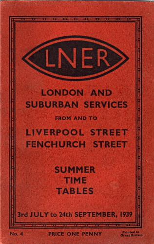
| Gill Sans Font used on a poster in the London North Eastern Railway |

With the aim of having its advertisement’s stand out the Gill Sans family ranges from Light to exaggerated Bold with each weight maintaining its own character. The light font has an elegant and open look, with its heavily kerned ‘f’ and tall ‘t’. It is mostly used in magazines and bookwork whilst the bold type is best used on advertisements and publicity forms. A more muscular and compact appearance is seen with the regular font with its flat-topped ‘p’ and ‘q’, flat-bottomed ‘d’, and short top ‘t.’
 |
| Gills Sans common weights and styles |
There
are noticeable contrasts between Gill Sans Regular and Gill Sans Italic. For
example the bold ‘a’
compared to the italic ‘a’.
Not only is the counter more prominent in the italic but there is no swooping
stroke at the end. Another example shows Gill Sans italic ‘p’ where the counter
and stem meet, it overlaps. This gives a more refined and humanized effect to
it.
Since
the 1930’s people have questioned Gill’s deletion of the foot serif in the
lower-case “1” in Johnston’s model. It allowed distinction between the numeral 1,
uppercase i, and lowercase L. In addition, Gill removed the ending of the vertical stroke in
‘p’, ‘q’, b’ and ‘d’, and change them so they were in the medium weight.
 |
| Comparison of lowercase L, uppercase i and numeral 1 in Gill Sans and Johnston |
 |
| Gill Sans Light (above) and Gill Sans Regular (below) |
Compared to the Helvetica g Gill Sans g is known as the eyeglass type. It stands out more often than that of Helvetica and differentiates itself from its other letters. It changes form entirely when changed to the Ultra Bold weight g. The thickness of the letter in the bold does not allow four strokes and two counters to fit within the vertical space. Gill Sans has also designed the lowercase ‘y’ with a straight descending tail to make the letter appear unbalanced and rigid. The capital M is based on the idea of a square. The middle strokes meet in the centre of that square whilst when comparing this to the Helvetica capital M, the strokes meet down the bottom.
Initially Gill Sans was used for commercialism
including advertising and headline use but now is increasing being used in body
text. Famous clothing brands such as tommy Hilfiger use Gill Sans in their logo, movies such as Toy Story and in 2009 Barrack Obama used Gill Sans on his Presidential campaign poster.
Reference List:
'Font Designer: Eric Gill' (2011) retrieved 3rd March from: http://www.linotype.com/391/ericgill.html
'Hidden Gems' (2011) retrieved 3rd March from: http://www.monotypefonts.com/Library/HiddenGems.asp?show=gillsans
'Know your type: Gill Sans' (2009) retrieved 3rd March from; http://idsgn.org/posts/know-your-type-gill-sans/
'Typeface of the month: Gill Sans" (2005) retrieved 4th March from: http://www.markboulton.co.uk/journal/comments/typeface-of-the-month-gill-sans
'Gill Sans' (2001) retrieved 4th March from: http://www.fonts.com/font/monotype-imaging/gill-sans
'Analysing Gill Sans' (2009) retrieved 4th March from: http://derricknation.wordpress.com/2009/05/17/a-look-at-gill-sans/


No comments:
Post a Comment