Monday, April 30, 2012

Discussion Point - Gemma Williams


Max Miedinger (pre digital)

Max Miedinger was born on December 24, 1910 in Zurich, Switzerland. He is best known for his contribution to the typographic field by creating the typeface Helvetica. He also created the typefaces Miedinger. Swiss 921, Monospace 821, and Swiss 721.

Max Miedinger began working in typography at the age of sixteen as an apprentice typesetter in Zurich Switzerland.

From 1936 to 1946 he was a typographer at Globus department store’s advertising studio in Zurich. In 1956 he was commissioned to develop a new sans-serif typeface. This was a revision of the popular 1896 typeface Akzidenz Grotesk. Miedinger’s new design 
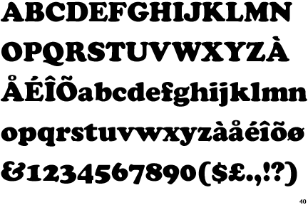
was named Neue Haas-Grotesk. In 1957 the typeface was renamed Helvetica to help sell it internationally.

Since the launch of Helvetica it has become one of the most widely used typefaces in the world. Many large companies use the font as their corporate logos.
Toyota Motor Corporation used the Helvetica typeface exclusively while building a brand from the 1960s through the 1990s. Many governments around the world use the typeface for their street signs because of its ease of legibility. Graphic designers use the typeface as a go to typeface when they want to easily express an idea.


 Matthew Carter (contemporary) 

Matthew Carter is a type designer with experience of typographic technologies ranging from hand-cut punches to computer fonts.

He was a co-founder in 1981 of Bitstream Inc., the digital typefoundry, where he worked for ten years. He is now a principal of Carter & Cone Type Inc. designers and producers of original typefaces.

His type designs include ITC GalliardSnell Roundhand, and Shelley scripts, Helvetica CompressedOlympianBell Centennial Address and ITC Charter.

Carter pioneered the design of fonts for use on screen, notably Verdana for Microsoft. Unlike most of the typefaces used on screens, which were designed for print and intended to be read on paper, Verdana was designed for use on the computer screen.

It was created from the beginning to be easily readable at small sizes, with simple curves and large, open letterforms. The letterforms are spaced more widely than in a print font so they are legible even when displayed in computer screens. Certain letters are spaced so that they never touch, regardless of combination (an next to an i, for example), because at small sizes connecting letters can form illegible.


  1. www.linotype.com/522/maxmiedinger.html

    www.maxmiedinger.com/

    www.identifont.com/show?16O

    http://designmuseum.org/design/matthew-carter

    http://www.aiga.org/medalist-matthewcarter/

Sunday, April 29, 2012

Discussion Point Wk9 - Melissa Hunt


Pre-digital: Hermann Zapf (‘Palatino’ released 1950)
German designer Hermann Zapf emerged as a leading type designer during the manifestation of the German and Swiss International Typographic Style around the 1950s. This movement saw unity, asymmetry, and mathematically constructed grids as central to its vision.
Zapf began as an apprentice photo retoucher at the age of 16, before studying calligraphy. It wasn’t until four years later that he entered Koch’s printing firm, becoming a freelance book and typographic designer. By the time he was 22, Zapf had designed in excess of 50 typefaces, with two of these cut for the Stempel foundry. His work was inspired by his earlier calligraphy work, illustrated by his sensitivity to form.
Released in 1950, Zapf’s ‘Palatino’ is roman in style, with broad letter forms, strong serifs and refined proportions.
Although created in the pre-digital era, Zapf’s typefaces speak of an understanding of futuristic technologies in the creation of complex and technically intense work. “Zapf combines a great love and understanding of the classical traditions of typography with a twentieth-century attitude toward space and scale (Meggs and Purvis, 2006).”
In addition, Zapf designed two editions of ‘Manuale Typographicum’ (published in 1954 and 1968); these books included more than 100 typefaces, information and typographic interpretations. 


http://luc.devroye.org/palatino2.html
http://www.behance.net/gallery/Palatino-Typographic-Poster/330655


Contemporary: Matthew Carter (‘Walker’ released 1995)
  Carter’s typeface ‘Walker’ was commissioned by the Mineapolis-based Walker Art Center, and is typical of his work as a typographic designer.
This typeface in particular, illustrates how Carter constantly pushed the boundaries of typographic design, and how the possibilities can be expanded.
‘Walker’ includes a concept called ‘snap-on serifs’, where serifs can be attached at the designer’s discretion to the vertical strokes of each letter, in addition to the availability of a variety of widths. Such a concept would not be conceivable in the pre-digital age. Carter also designed a series of lines running over, under and through the typeface in a consideration of unity.
His designs were based on the ideology that “I think of them [letterforms] rather as store window mannequins with good bone structure on which to hang many different kinds of clothing.” Hence, he included a range ligatures and alternate characters, giving the Walker Art Centre freedom and creative input.  


http://blogs.walkerart.org/design/2008/05/09/flat-files-6-experimental-posters/
http://2143.tumblr.com/post/91726863/matthew-carter-walker-typeface-via
http://www.aiga.org/medalist-matthewcarter/


References:
P.Meggs, A.Purvis (2006). “Meggs’ History of Graphic Design.” John Wiley & Sons, Inc, Canada.

This week...

The early release of last week's lecture places us in a good position for focussing on the studio and the development of content and structure of the online magazine.

Your early responses to the discussion points are much appreciated and they do read really well.
So to reitterate. The current lecture on the typographic context was released early but if you haven't had the chance to read it check it out here.

The first additional link out this week is a really useful game that helps sharpen your sensibilities in regard to the kerning of type. For those of you who are't yet aware kerning is a powerful tool for creating harmonious distribution of negative space between typographic characters and is spoken of in the context of letterspace one of the three spaces of type.

The objective of the game is as follows:

Your mission is simple: achieve pleasant and readable text by distributing the space between letters. Typographers call this activity kerning. Your solution will be compared to a typographer's solution, and you will be given a score depending on how close you nailed it. 
The game is called KERN TYPE and can be found here...

The second link out this week is another interactive experiment that is type related. This project is based aroudn the conceptual metaphor that "Type is an organism". the site features seven different typographic investigations that are all interactive in different ways.

The project is called typoganism...


Both these innovative approaches to thinking about typography demonstrate that when thinking about typographic context we must acknowledge the integral role that the evolution of technology has played in the development of type.  Essentially type has always been closely linked to new technologies. This is almost an understatement but needs to be pointed out becuase we so often take the quotidian for granted without really considering it's iimport and how we as the designer might exploit it's potential. Hopefully this is something that is being made apparent as we engage with the world of online publishing int eh current project.

If you have yet to repsond to the current Discussion Point here's a reminder:

Discussion Point: Select two innovative typographic designers - one pre-digital (1984), the other contemporary. Provide a brief comparative analysis of their contributions to typographic practice supported by relevant examples of their work. Post your response to the Studio Blog.

Discussion Point: Clarisse Djaja


Paula Scher - pre 1984:

"I learned typography by rubbing down press type and all those students would rub down very neat helvetica in all their images and my helvetica would bubble and crack and look terrible. I had this fantastic Polish illustrator as my teacher... and he told me to illustrate the type, to illustrate with type... that piece of advice has served me my whole life." New York designer Paula Scher has been known to design many well-known logos and posters including the Citi Bank logo and the Windows 8 logo. Before the digital era, Scher started off designing record covers. Some albums she designed was for Boston, Boston (1976), Leonard Bernstein, Stravinsky Poulenc (1976) and The Best of Jazz (1979). This was her process: she would make a C print of the illustration or the photograph, take a piece of acetate and paint the typography on top of it by hand. Even though that was the way in which they used to present things, Scher refers to this as her "craft". The essence of 'craft' had never left her work as each of them seem like they have been put together by hand. All of her works have type that seem like they're moving.


David Carson - post 1984:


"... it was self-indulgent (referring to his graphic design work), it was the big negative term which I think is a very positive term. I wouldn't want anyone working for me who wasn't doing self-indulgent work, totally absorbed in it. So as we get more computerised I think it becomes more important that the work actually becomes more subjective, more personal, and that you let your personality come through the work." David Carson was known as the grunge graphic designer in the 1990's with his experimental graphics. This is evident in his works for Monster Children, a skateboard magazine established in 2003 and Ray Gun, an alternative rock and roll lifestyle magazine established in 1992. 'Deconstructive typography' would describe some of Carson's work as he chops, overlays, scribbles over and blots out his typography. His aim was to draw the viewer's attention to each article in different ways, rather than for them to just skim read across. For one particular article, he used the Dingbat font to replace the latin alphabet since he said it was a "boring article". He printed the whole article (the legible one) at the back of the issue.


References:

http://hillmancurtis.com/artist-series/paula-scher/
http://ecx.images-amazon.com/images/I/51wSXLMNFyL.jpg
http://vanyavasileva.files.wordpress.com/2011/01/8.png
http://marcleacock1.files.wordpress.com/2011/10/best-of-jazz.jpg

http://hillmancurtis.com/artist-series/david-carson/
http://www.davidcarsondesign.com/work/magazine/
http://lucagrosso.files.wordpress.com/2011/03/raygun1994.jpg

Discussion Point - Tara Nikolin


Paul Rand (1914-1996)
Born in America, Rand was strongly influenced by the work of European Modernism such as Constructivism and De Stijl. He developed a personal style based on European values that was fused with quirky American language and a lot of typography. Unlike other designers of his time, Rand scrapped ornamentation and embraced sharp forms and clean lines. He became extremely well known for his beautifully simplistic corporate logo designs, many of which are still used today, such as IBM, ABC and Westinghouse. Rand was also interested in designing advertisement and book covers. He planned his compositions to draw the viewer in, using simplicity, expression and abstract complexity. To do this, Rand broke away from the ‘conventional’ standards of typography and began to use the International Typographic Style or ‘Swiss Style’, developed in the early 1950’s and based upon one of the orginial sans serif typefaces, Akzidenz-Grotesk, which was released in 1896. This style emphasised cleanliness, readability and objectivity. Rand brought life to the typography by combining it with variations in scale, a controlled use of colour and intriguing shapes and forms. He is considered to be one of the heavy-weights of the graphic design world and a pioneer of the modern graphic design profession, inspiring many of the graphic designers who came both during and after his influential career.


Stefan Sagmeister (1962 - Still truckin')
Sagmeister is a prolific contemporary graphic designer and typographer. Based in New York City and from an Austrian background, Sagmeister is well known for his print work which includes: CD covers, book covers, editorials, posters and large-scale installations. He is also extremely well known for his edgy and original compositions, many of which have the ability to shock and awe an audience. Sagmeister has worked heavily with typography. Instead of conforming to the norm and using conventional typefaces like other graphic designers, he regularly implements his own handwritten scrawl, creating a quirky blend of typography with careful image and illustration selection. Unlike Rand, Sagmeister uses his typographic design to express a piece of his personality and a personal viewpoint, as opposed to remaining objective such as was found in the Modernist movement that Rand embraced. Sagmeister has also embraced creativity and constantly tries to come up with new ways of expressing ideas. He has used the human body, food, objects and various methods such as installations and videos to portray his typographic ideas.  Here is a video you should all check out:  http://www.youtube.com/watch?v=o8PkFSLuYOk  :)


References:
Heller, S (1999). Paul Rand, London: Phaidon Press.


Discussion Point - Katrina Hirakis


Derek Birdsall (1934 - present)

Born in Wakefield, Yorkshire in 1934 Derek Birsall has grown to become a designer that emphasises the beauty of typography. 
His talent started at the young age of fifteen when he joined Wakefield Collage of Art choosing to study lettering. During his three years at Wakefield he, "dabbled in letterpress, bought a printing press of his own and began to manufacture cards for local businesses". Later, Birdsall was accepted into 
the Central School of Art and Design in London 1952 where he was taught the difference between beautiful lettering and typography proper, with its pre-eminent concerns of clarity, directness and textual legibility. 


In 1967 Birdsall started his own studio naming it 'Omnific' wherein he designed for Penguin books with a complete re-style of the 1970 education series, art-directed Town and Nova magazines, designed advertisements and literature for Lotus cars and Mobil Oil in New York and produced the series of Pirelli calendars (work by which he is best known for).

The preface of Birdsall's 2004 book notes on design introduces, "

simply the decent setting of type and the intelligent layout of pictures based on a rigorous study of content. This is the organising sensibility of all great graphic designers, who manage to contrive tension and sublimity within the exercise of reason. His innocuous recommendation is also, curiously enough, shared by avant-garde mentors of today including Rem Koolhaas and John Thackara: the sense that design needs to be re-conceived as the organisation of what already exists, 
rather than as the deliberate creation of novelty. 

Steve Jobs (1955 - 2011)

Steve Jobs was not only a business man but also a dedicated designer and someone who many might know of his past. Jobs attended Reed College where, "throughout the campus every poster, every label on every drawer, was beautifully hand calligraphed". Though later dropped out and decided to take a calligraphy class to learn how to create such pieces of work that he saw at collage. In this class Jobs learned about serif and san serif typefaces, varying the amount of space between different letter combinations and what makes great typography great. In his words, "it was beautiful, historical, artistically subtle in a way that science can’t capture, and I found it fascinating". 

Jobs furthered his fascination with computers and took no note of how he could apply his calligraphy life. Though ten years later when first designing the Mac computer a connection between the two were made. As jobs states, "we designed it all into the Mac. It was the first computer with beautiful typography. If I had never dropped in on that single course in college, the Mac would have never had multiple typefaces or proportionally spaced fonts. And since Windows just copied the Mac, its likely that no personal computer would have them. If I had never dropped out, I would have never dropped in on this calligraphy class, and personal computers might not have the wonderful typography that they do". 


References:
Derek Birdsall - http://designmuseum.org/design/derek-birdsall
Steve Jobs - http://www.planet-typography.com/news/typo/steve-jobs.html

Saturday, April 28, 2012

Discussion Point - Alana Peddie


Herbert Bayer

Herbert Bayer was born in 1900 in Northern Austria. At the age of 21 Bayer was accepted to study at the Bauhaus School, a German art school founded by the architect Walter Gropius and one of the largest influences on the direction of 20th century design. Bayer studied under the schools great professors for four years and upon his graduation was appointed by Gropius to direct the new "Druck und Reklame" (Printing and Advertising0 workshop to open. It was within this role that Bayer instituted the lowercase alphabet as the style for all Bauhaus printing, and to accompany this Bayer was commissioned to design a typeface for all Bauhaus communiques. The result was the geometric sans serif typeface "universal" .

Bayer left the Bauhaus and became the art director of Vogue magazine in Berlin until 1938 when he moved to New York City, When settled he worked in associateion with Walter Gropius to design the exposition "Bauhaus 1918-28" at the New York Metropolitan Museum of Modern Art.

Bayer died at the age of 85 in 1985, leaving behind him an outstanding career whcih is respected as having affected nearly every field of the arts, especially typography.

David Carson
David Carson (born 1954) is an American graphic designer. Carson is best known for his innovative magazine design and experimental use of typography. Highly influential, especially during the 1990's he's "grunge typography" era was widely imitated. Carson broke the traditional mould of how type was displayed on a page, exploding its possibilities and making the point that letters are art. David Carson's typographical treatments largely integrate photography to produce a minimal low-fi look.
Carson started designing in the 80's with no formal schooling in the field, his work became well know in the late 80's and early 90's through skateboarding and surfing magazines. He later started the lifestyle and music magazine the Ray Gun Magazine, and went on to start his own design firm, David Carson Design.
Sources
Bayer
http://www.type.nu/bayer/
http://www.type.nu/bayer/univer.html
Images: http://perlica.blogspot.com.au/2011_03_01_archive.html
              http://anasokolovic.hotglue.me/herbert

Carson
http://www.ted.com/speakers/david_carson.html
http://en.wikipedia.org/wiki/David_Carson_%28graphic_designer%29
http://www.arsgrafik.com/david-carson/
Images: http://www.magazine.org/asme/top_40_covers/index.aspx
              http://www.davidcarsondesign.com/

Discussion Point


Beginning as an illustrator and discovering the practice as not his preferred aspect, Oswald Bruce Cooper pursued a career in type and graphic design.  Starting off as a designer for advertisements, Cooper later designed his most known famous typeface, The Cooper Series.  The Cooper Series published in 1918 was based on Cooper’s very distinct and unique hand style that he crafted earlier in his career.  He was approached to design a group of typefaces based around his letterforms.  Though, it was the Cooper Black Series that was published in 1922 that provided evident exposure to himself and his design studio, that being the intention of Fred Bertsch.  Cooper’s typeface was based around the idea of creating a heavy modernist typeface in both terms of height and weight.  It allowed for heavy black type to resonate and impact typographers and graphic designers.  As a result to the immense up rise, Cooper Black was pronounced as The American Type Founder’s 2nd best font at the time.  Cooper’s type face evolved in the later years, with the induction of the Cooper Fullface series in 1929, with the creative imagery of a post modern ‘swing’, flavour.  The ideal destination of this font was to be placed upon advertisements, due to its capability to provide accessible vision for long sightedness because of its heavy structure.  

The 20th and 21st Century lead to the increase of digital typography, and with the influence of Adrian Frutiger, the impact arose.  Alike Cooper, Frutiger had a first strive towards a career other than type, this being in sculpture.  But being looked down upon as his wanted profession, Frutiger took up print and design as a career with the influence from family and peers.  Beginning in the world of print as a wood carver, he was adopted into the industry along Charles Peignot.  With his passion in calligraphy, he designed the type face Ondine in 1954, although Frutiger was predominantly known in the print world for the iconic and prolific designs of Avenir, Univers and Frutiger type.  Produced after the Frutiger Series, Avenir was characterized around the idea of a geometric sans-serif in 1988.  Taking the name Avenir meaning future, the intention was to design a typeface embarking an organic nature with precise background of geometrics.  Being of less in weight compared to the previous Frutiger series, Avenir has been widely distributed and presented within many 21st Century corporations, specifically, through the LG Electronics and BBC Two. 


The nature of each font is ideal for different and diversified applications within the design and print industry.  Cooper and his Family Series, is depicted to be presented within the confines of a poster like advertisement, whereby it is utilised  for long-sightedness for the audience due to its noticeable and obvious heavy structures.  As a result, this idea is in contrast to the application is usage of Frutiger's Avenir, whereby the use is present within products rather than print media.  All in all, these two designers, Cooper and Frutiger have left their mark within not only the type and print world and aspect but within design and visual communication as a whole.  They both contribute to publication and advertising are innovative in their own respect.


References
Typedia.  2009.  Oswald Bruce Cooper.  Available at: http://typedia.com/explore/designer/oswald-bruce-cooper/

Linotyoe.  Type Gallery, Avenir.  Available at: http://www.linotype.com/1116-13417/interviewwithafrutiger.html?PHPSESSID=22ed7b38a29d021006a5ca0d1c44f0b6