Beginning as an illustrator and discovering
the practice as not his preferred aspect, Oswald Bruce Cooper pursued a career
in type and graphic design. Starting off
as a designer for advertisements, Cooper later designed his most known famous typeface,
The Cooper Series. The Cooper Series
published in 1918 was based on Cooper’s very distinct and unique hand style
that he crafted earlier in his career.
He was approached to design a group of typefaces based around his
letterforms. Though, it was the Cooper
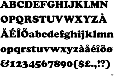
Black Series that was published in 1922 that provided evident exposure to
himself and his design studio, that being the intention of Fred Bertsch. Cooper’s typeface was based around the idea
of creating a heavy modernist typeface in both terms of height and weight. It allowed for heavy black type to resonate and
impact typographers and graphic designers.
As a result to the immense up rise, Cooper Black was pronounced as The
American Type Founder’s 2nd best font at the time. Cooper’s type face evolved in the later
years, with the induction of the Cooper Fullface series in 1929, with the creative
imagery of a post modern ‘swing’, flavour.
The ideal destination of this font was to be placed upon advertisements,
due to its capability to provide accessible vision for long sightedness because
of its heavy structure.
The 20th and 21st
Century lead to the increase of digital typography, and with the influence of
Adrian Frutiger, the impact arose. Alike
Cooper, Frutiger had a first strive towards a career other than type, this
being in sculpture. But being looked
down upon as his wanted profession, Frutiger took up print and design as a
career with the influence from family and peers. Beginning in the world of print as a wood
carver, he was adopted into the industry along Charles Peignot. With his passion in calligraphy, he designed the
type face Ondine in 1954, although Frutiger was predominantly known in the
print world for the iconic and prolific designs of Avenir, Univers and Frutiger
type. Produced after the Frutiger
Series, Avenir was characterized around the idea of a geometric sans-serif in
1988. Taking the name Avenir meaning
future, the intention was to design a typeface embarking an organic nature with
precise background of geometrics. Being
of less in weight compared to the previous Frutiger series, Avenir has been
widely distributed and presented within many 21st Century
corporations, specifically, through the LG Electronics and BBC Two.

The nature of each font is ideal for different and diversified applications within the design and print industry. Cooper and his Family Series, is depicted to be presented within the confines of a poster like advertisement, whereby it is utilised for long-sightedness for the audience due to its noticeable and obvious heavy structures. As a result, this idea is in contrast to the application is usage of Frutiger's Avenir, whereby the use is present within products rather than print media. All in all, these two designers, Cooper and Frutiger have left their mark within not only the type and print world and aspect but within design and visual communication as a whole. They both contribute to publication and advertising are innovative in their own respect.
References
Typedia. 2009. Oswald Bruce Cooper. Available at: http://typedia.com/explore/designer/oswald-bruce-cooper/
Linotyoe. Type Gallery, Avenir. Available at: http://www.linotype.com/1116-13417/interviewwithafrutiger.html?PHPSESSID=22ed7b38a29d021006a5ca0d1c44f0b6
No comments:
Post a Comment