Bacardi is one of the most recognisable brands in the world
and this can be attributed to their very specific and comprehensive visual
identity guidelines. Their most recent style guide published in 2007 provides
an all-inclusive set of guides that help ensure consistency within the brand in
order to maintain control amongst all markets and applications.

The Brand Marques

The Wing Device

Do's and Dont's

Usage

Photography Principles
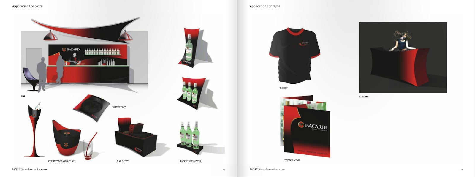
Application Concepts
Every possible aspect of application including corporate
usage of their logo have been considered, and very clear and precise
restrictions have been put in place to ensure a consistent visual language.
Strict guidelines concerning the spacing and size restrains of the logo, fonts,
as well as the colours of both the logo and backgrounds in images that can be
used to ensure legibility of the logo/brand are outlined. Even how the logo
should be applied if there is not sufficient print space has been outlined. The
style guide also specifies when to use different 2D and 3D applications of the
logo and provides images inspiring the shapes of the aesthetic language and includes
possible applications of their visual identity on products and systems. There
is also a section on the materials and finishes that can be connected with the
brand and emotions that must be conveyed through the photography used. I believe all these elements combined ensure an easy to understand guide
outlining the best way to apply the visual elements to represent the brand and
ultimately create consistency amongst all collateral material, which ultimately
allows the brand to maintain control over their image.
Reference:
Bacardi, (2007), ‘Visual Identity Guidelines, Off Pack
Communication, May 2007’, Bacardi Styleguide (2008) by Kyka on Issuu, http://issuu.com/kyka/docs/bacardi_styleguide
No comments:
Post a Comment