Originally, the Inland Foundry produced Rockwell in 1920 and it was issued as Litho Antique. The company later merged with 22 other type foundries to form the American Type Founders in 1912. Morris Fuller Benton was the chief type designer at the ATF and they revised Rockwell under the direction of Benton [2].
The Rockwell typeface was re-released in 1932 and Frank Hinman Pierpont along with the Monotype Corporation supervised its re-design. Some errors occurred during this revision where Rockwell was referred to as Stymie Bold, which created some confusion about Rockwell’s identity that still exists today. It originated in the United Kingdom but has since been popularized all over the world [3].
Rockwell’s classification is Serif, Slab Serif and Geometric Serif. It has a strong display face for headlines and posters and is also legible in short text blocks [4]. Its strong presence along with bold colour application uses its aesthetic to the full extent. Some people may also give Rockwell emotional qualities: stable, constant, reliable, strong – all of these adjectives describe what some people may feel when they see a body of text in the Rockwell typeface.
https://blogger.googleusercontent.com/img/b/R29vZ2xl/AVvXsEjNUkCT6ZcmtNS-83XWoykctQJM5S8f9O0t3VxfTi_9Q8IAO8rvWJ2MO6AIxmATEEha7v4IB83V6ZXUPpI-LwTdCZX6960562Wvbp4ExyzzJxtyTyXwpzAGumQURUF_Wj8nym5llc3GU3M/s1600/image_26.jpg
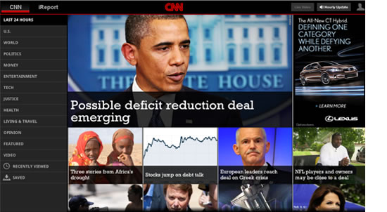
In the above picture, Rockwell is seen in the application of the headline 'Possible deficit reduction deal emerging'. Coupled with a concerned and contemplative image of Barrack Obama, the headline immediately implies importance and relevance to its readers.

http://behance.vo.llnwd.net/profiles4/177540/projects/540712/c661cb981752c7095a13e94e03754d21.jpg
This picture shows a playing card that showcases the Rockwell typeface. With the addition of bright, block colours against a plain black bagkround, the packaging looks playful, contemporary and chic.
Other features of Rockwell include:
· A bilateral, abrupt serif form
· A vertical axis
· Un-bracketed serifs
· Open counters (its uppercase
· The ascender of the lower case
· The lower case ‘a’ is two-story
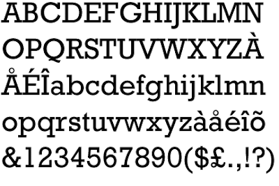
Many of the upper case letters such as ‘I’, ‘J’, ‘K’ that has stems which ascends vertically, has the bilateral serif on top of it to give it a weightier, more solid look. All other letters, which has ascenders that meet in an apex, has a unilateral serif with the exception of ‘A’ and ‘W’.
Overall, Rockwell is a flexible typeface with many looks and applications despite its long history. It arrests the attention of the viewer and conveys messages through its strong and weighty aesthetic.
[1]'Rockwell' (2011) Retrieved: 27th March, 2012. http://www.fonts.com/findfonts/hiddengems/rockwell.htm
[2] 'Morgan - Rockwell' (2010) Retrieved: 27th March, 2012. http://kernthat.blogspot.com.au/2010/11/morgan-rockwell.html
[3] 'Rockwell' (2011) 27th March, 2012. http://www.fonts.com/findfonts/hiddengems/rockwell.htm
[4] 'Rockwell' (2012) Retrieved: 27th March, 2012. http://typedia.com/explore/typeface/rockwell/
No comments:
Post a Comment