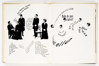
There is the old adage ‘ rules were made to be broken’ but sometimes the rules are the oen thing stopping us from breaking apart. Should we always break the rules or is it some times best to follow them in order to produce something beautiful. Someone who did break the rules was French graphic designer ‘Robert Massin’ who in notable for this innovative experimentation with expressive forms of typographic composition.
Massin highlighted the idea that the letter is lost within the word, the job of the letter is to be perceptible yet invisible, silent and yet a mental projection of speech, it’s principle job is to be unobstrusive as possible, but what happens when the letter become obtrusive. THey can then stand alone like a building or a monument, removed from the word and its semanitc implications, the letter becomes an entity in itself. His book ‘La Cantatrice Chauve ‘The Bald Prima Donna’’ was an integration of image and word as an expression of the test. He shared with the reader his enthusiasm for the diversity of letterforms and raised questions about the expressive power of letterforms. Seen below is the example from the book and his book ‘Letter and Image’ are his experimental use of layouts and lack of grids and structure. He doesn’t appear to be following any rules, yet his images are still so powerful and evoke a sense of movement. He is a perfect example of how breaking the rules and showing something new, can turn out to be something extraordinary.
WIth the freedom in today’s world for designer’s to manipulate text and image on screen, in any layout, the possibilities are endless. However sometimes it is worth sticking to rigid guidelines and grides in order to produce a design that is worthy and suitable of the consumer.
An example of this is the ‘Wall Street Journal’ who for half a century presented nearly identical front-page layouts. Always six columns, with the day’s top stories in the first and sixth columns, ‘What’s News’ digest in the second and third, the ‘A-hed’ feature story in the fourth and themed weekly report in the fifth column. It wasn’t till 2007 in order to save newsprint costs (DOw Jones said it would save $18 million a year in newsprint costs) that the layout was changed.
THe paper still uses ink dot drawings called ‘hedcuts’, in addition to photographs, and a method of illustration considered to be a consistent visual signature of the paper.
Form this publication sticking to the typographic conventions and traditions has allowed them to consistently produce a publication that captures attention and considers its context, by which it needs to be ‘taken seriously’ and interpreted immediately.
In my personal opinion there is no right or wrong, no yes or no, you can’t follow the rules all the time but the rules sometimes help more than you think. I personally like applying typographic conventions such as grides, margins, layouts and structure. It gives a more professional design and the consumer or reader can tell time, effort and thought process has gone into the work. Yet sometimes going completely off cuff and ‘winging it’ produces amazing freedom.
http://nina-mcnamara.blogspot.com.au/2010/11/letter-and-image.html
http://www.eyemagazine.com/feature.php?id=47&fid=308
http://en.wikipedia.org/wiki/The_Wall_Street_Journal


No comments:
Post a Comment